Grocery Shop Web App
Designed an intuitive grocery shopping web app for busy professionals, focusing on simplifying product search and checkout flow to save time and make shopping effortless.

Adobe Illustrator


To better understand user needs and challenges, I conducted a user interview with Maya Mercer, a busy marketing manager and mother of two. The goal was to learn about her grocery shopping habits, pain points, and expectations from an online grocery shopping app.
• Shops for groceries once a week, prefers online shopping for convenience.
• Time-saving features like quick checkout and saved lists are highly valuable.
• Needs clear product information and easy navigation.
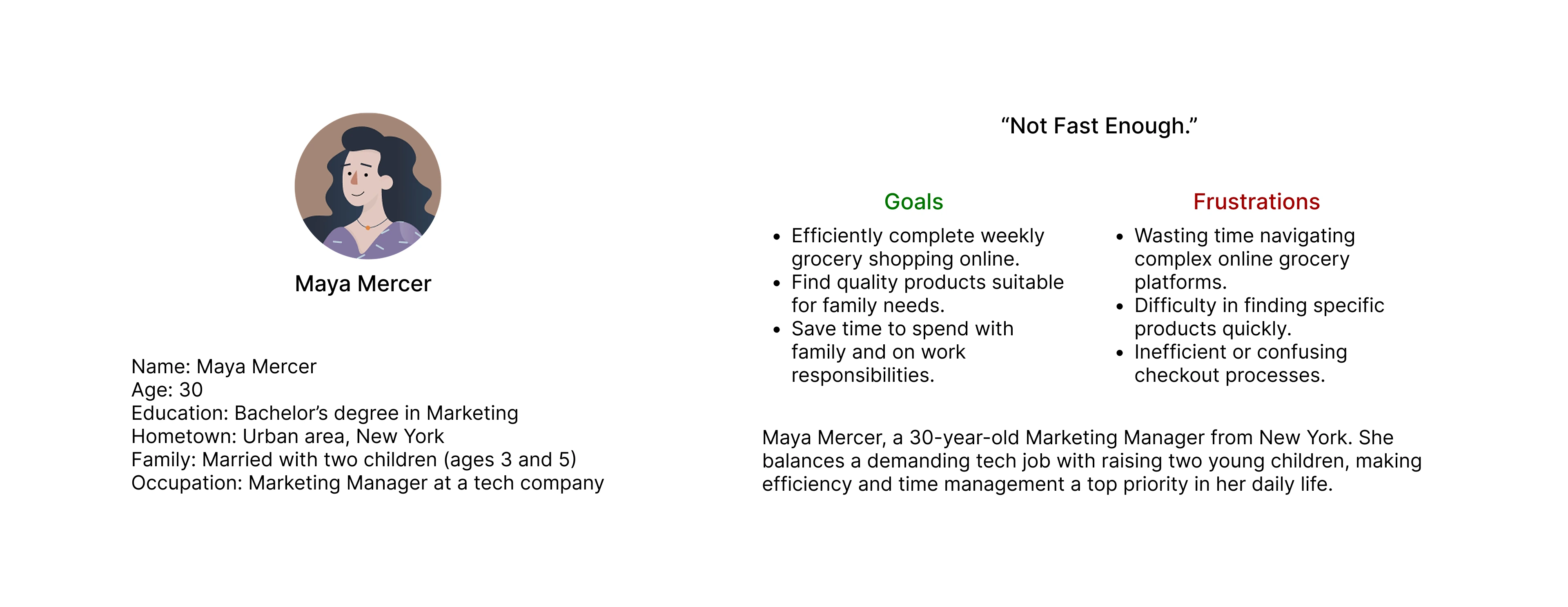
As a busy Marketing Manager, I want to efficiently complete my weekly grocery shopping online so that I can save valuable time to spend with my family and focus on work responsibilities.
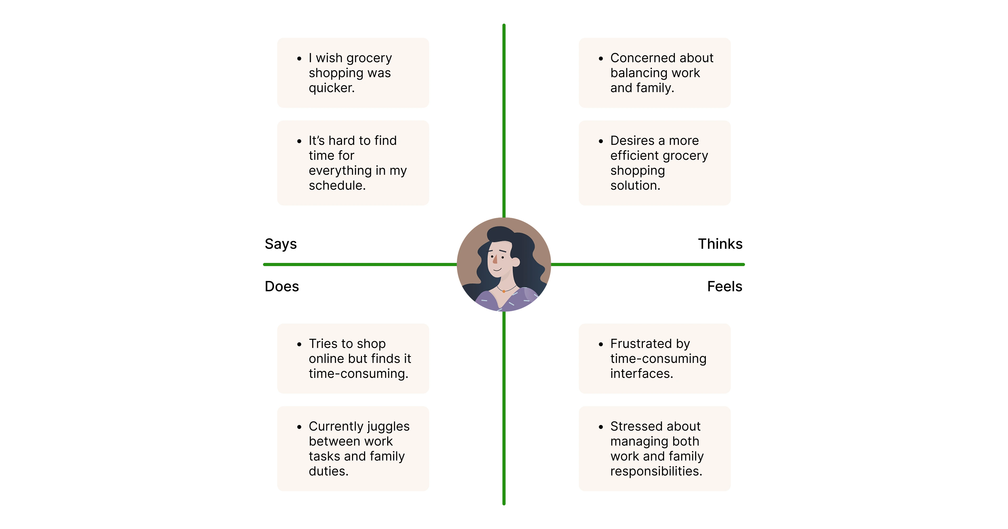
Persona: Maya
Goal: Visualize and understand the mobile web app for grocery shopping.
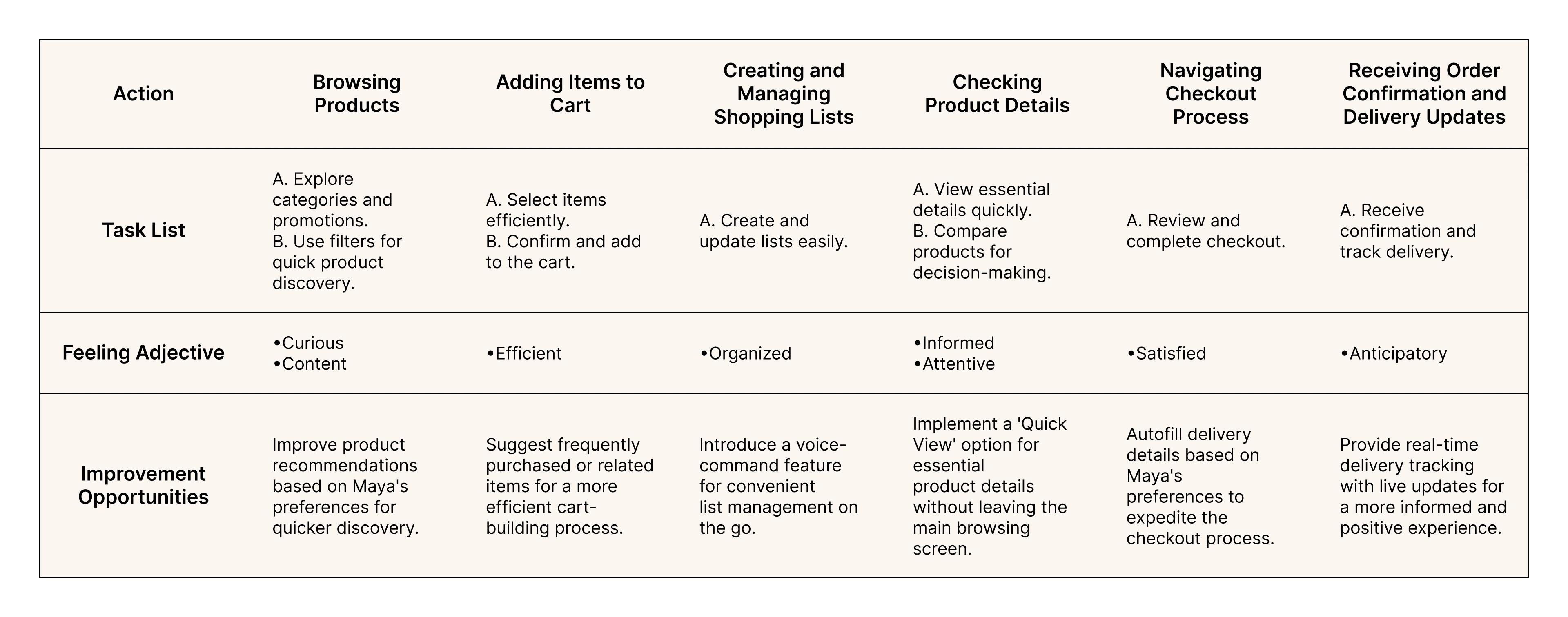
Maya is a 30-year-old Marketing Manager, who needs an easy grocery shopping experience, because time-consuming interfaces are making it hard to balance work and family.
• How might we make Maya's online grocery shopping faster and easier?
• How might we organize the app so Maya can quickly find what she needs?
• How might we save Maya time by remembering and suggesting her usual items?
• How might we design a mobile app that fits into Maya's busy schedule?
• How might we suggest personalized items to make Maya's shopping experience more convenient?
Our grocery shopping app will let users efficiently complete their shopping tasks which will affect busy individuals by simplifying the process and positively impacting their ability to balance work and family. We will measure effectiveness by tracking shopping time and collecting user feedback on app usability.
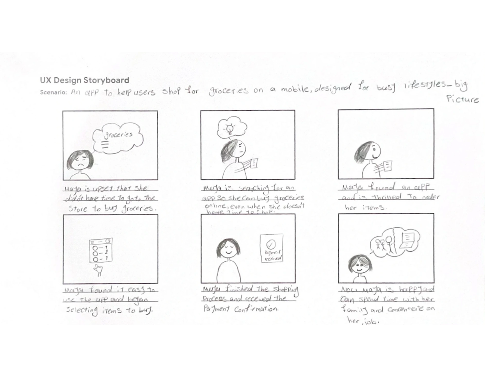
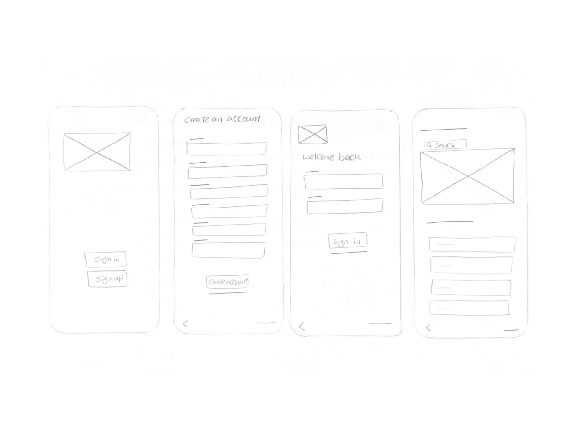
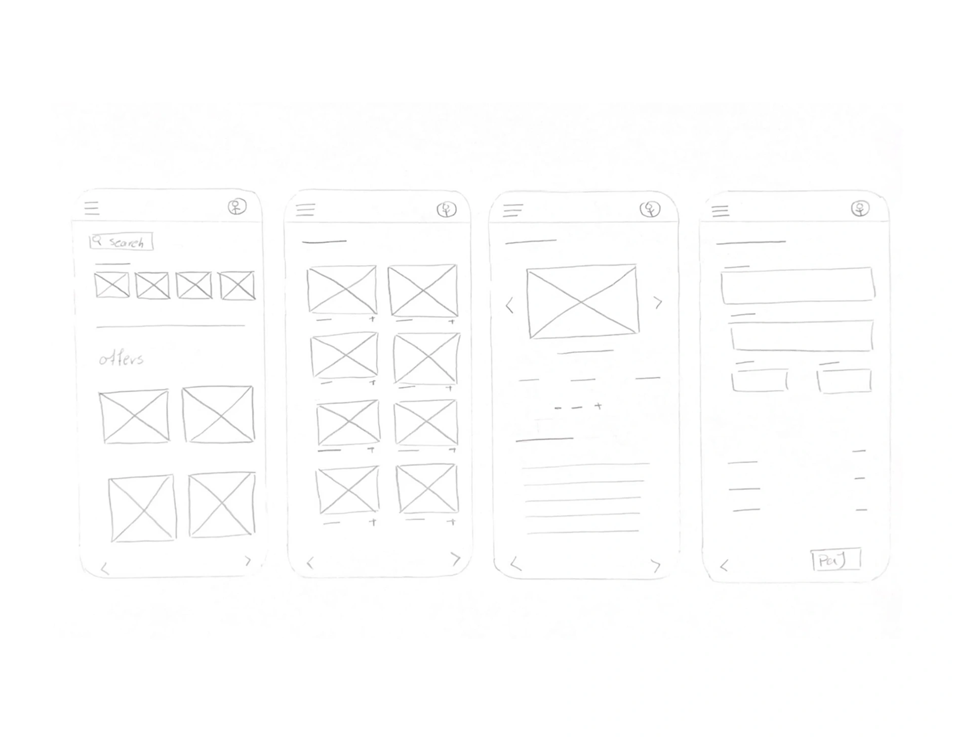
Big picture storyboard
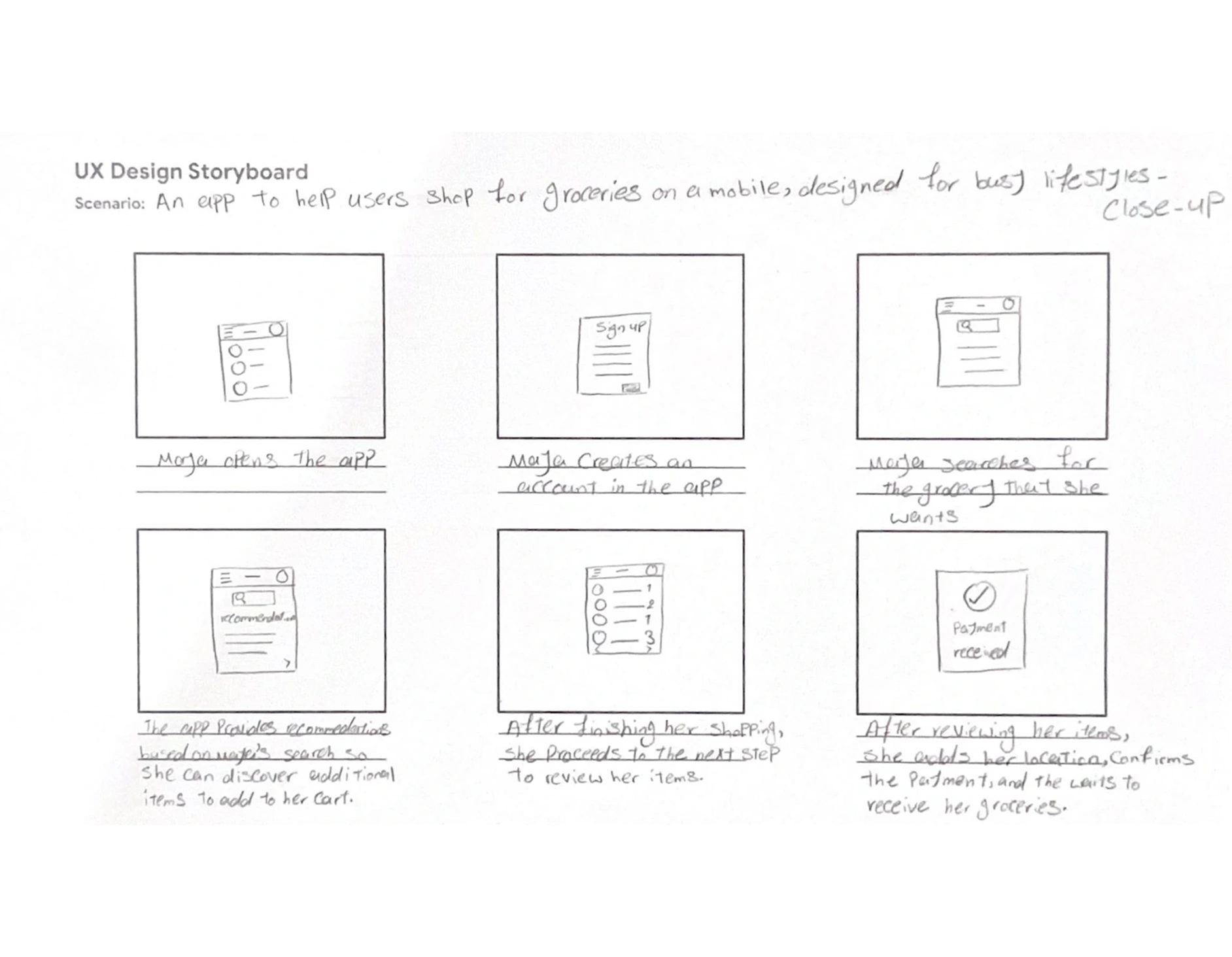
Close-up storyboard

Title:
Usability Study – Grocery Web App
Objective:
Identify pain points of busy professionals when shopping for groceries online and find opportunities to improve navigation, product discovery, and checkout flow.
Methodology:
• Type: Unmoderated usability study (remote)
• Sessions: 30–40 minutes per participant
• Date: Jan 2, 2024
• Location: Remote (participants’ own environment)
Participants:
• 2 participants (1 male, 1 female)
• Age range: 25–50
• Busy professionals with full-time jobs and families
Research Questions:
• What problems do users face with grocery apps?
• How can we simplify navigation and checkout flow?
• Which features matter most to busy users?
KPIs:
• Time on task
• User error rates
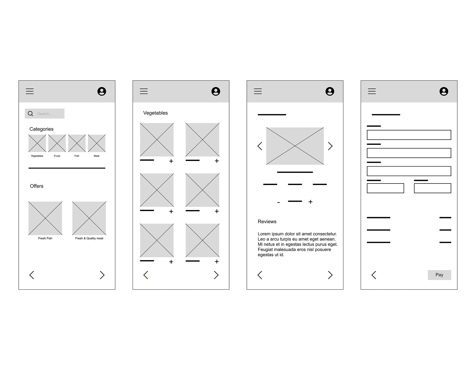
Usability Test Prompts:
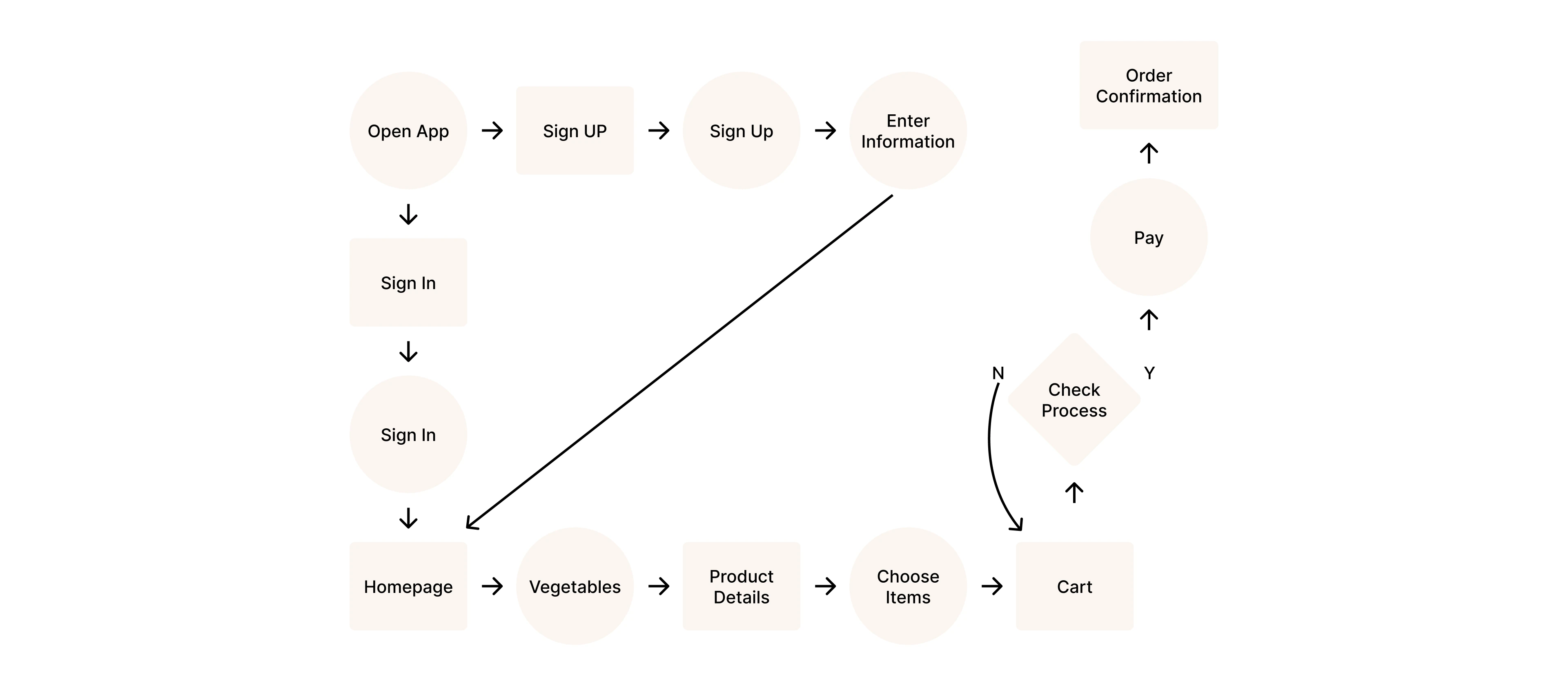
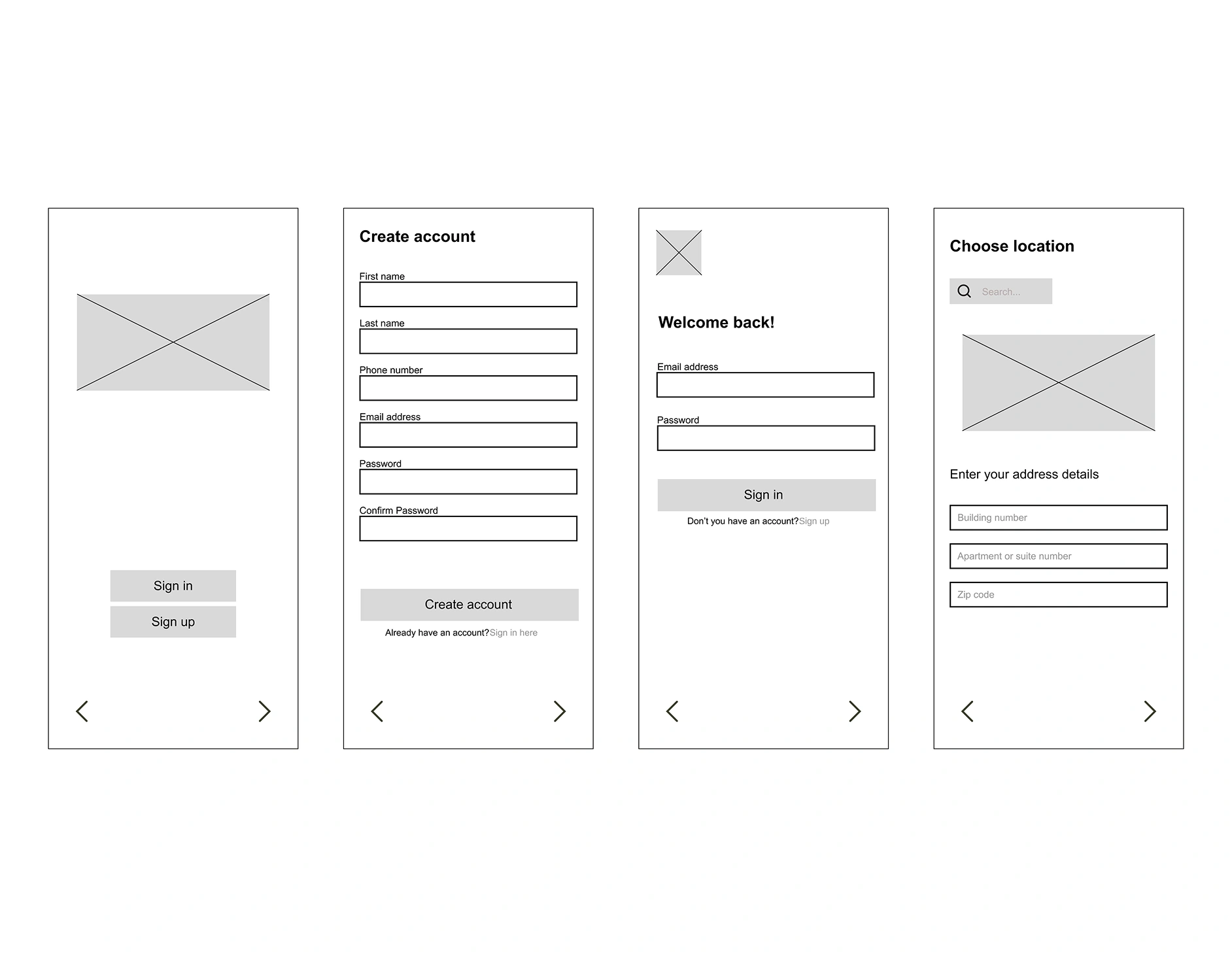
1. Sign up and create an account
2. Select a category and choose a product
3. Complete the checkout process
Participants rated:
• Ease of use
• Navigation clarity
• Confidence using the app
• Consistency of design
• Perceived complexity
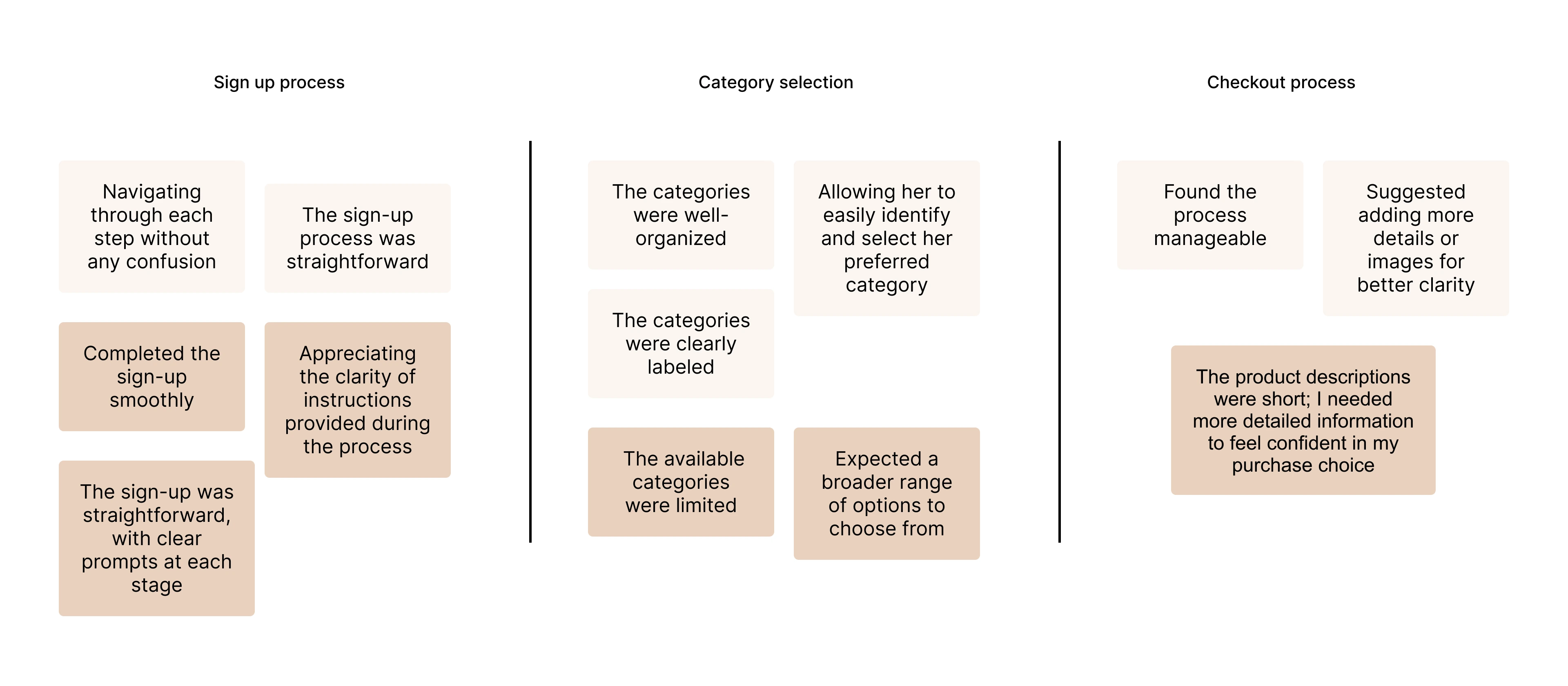
I conducted an unmoderated usability study with two participants, Ethan and Sophia, to evaluate the sign-up, category selection, and checkout flow of the grocery web app.
Ethan’s Feedback
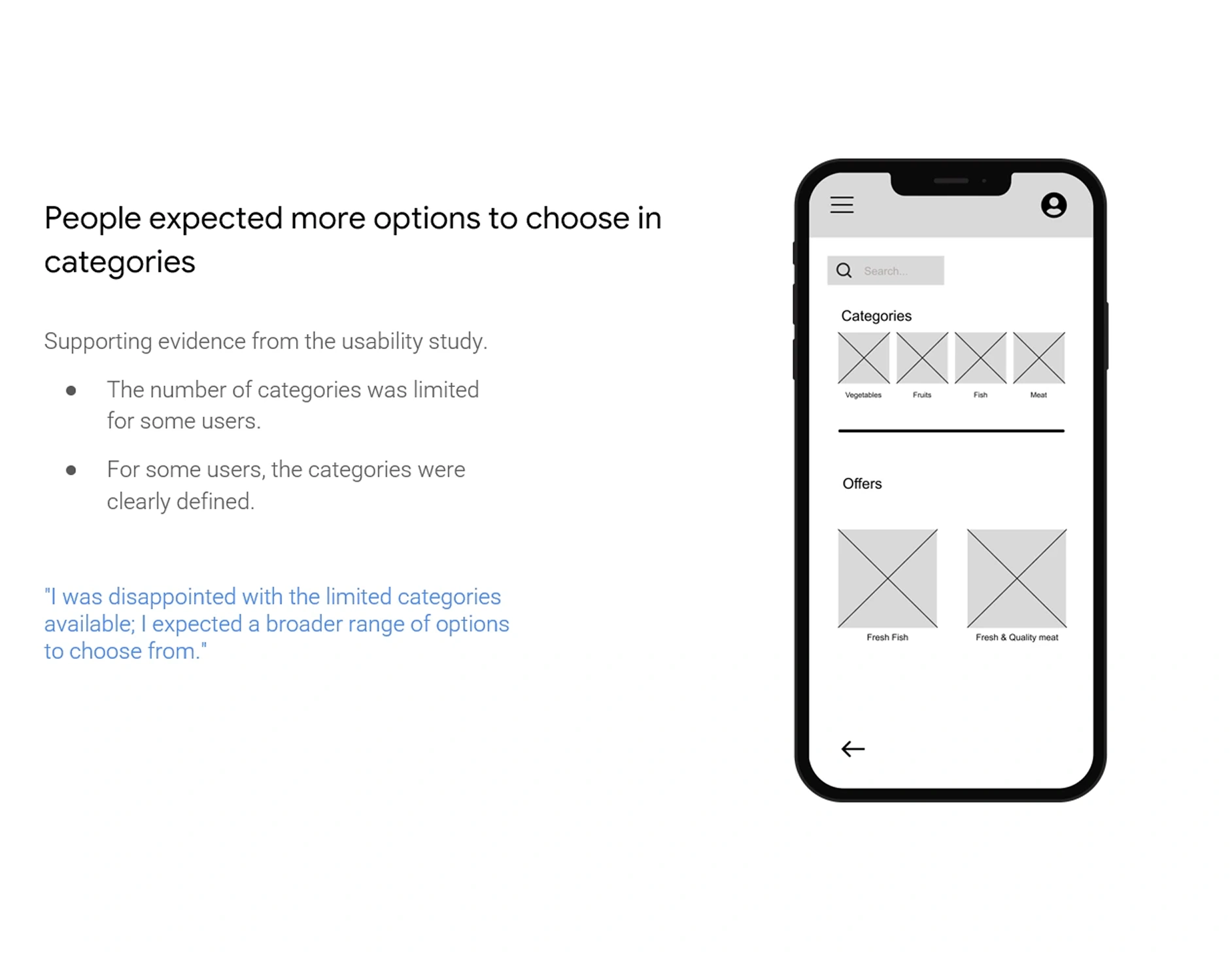
Ethan completed the sign-up process smoothly, appreciating the clarity of the instructions. However, he expressed frustration about the limited number of categories and found product descriptions too brief to make confident purchase decisions. He struggled slightly during checkout due to missing details, which delayed his decision-making.
Sophia’s Feedback
Sophia found the sign-up process intuitive and easy to follow. She appreciated the well-organized categories, but during checkout, she suggested adding more details and images to help users make more informed choices. Overall, her experience was positive but highlighted opportunities to improve product detail pages.
Key Takeaways
• Sign-up process works well for both participants.
• Category section needs more variety (Ethan’s feedback).
• Product detail pages need improvement with richer descriptions and images (both participants mentioned this).
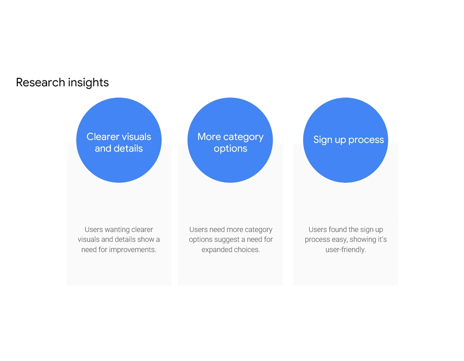
After conducting the unmoderated usability study, I analyzed the participants' feedback and synthesized the key insights. The following themes summarize the most important findings that guided the next design iteration.
• Sign-up process is user-friendly – Both participants completed sign-up easily without confusion.
• Category options feel limited – One participant expected more variety and suggested expanding available categories.
• Clear category organization – Another participant found categories well-structured and easy to navigate.
• Need for richer product details – Both participants asked for more visuals and descriptive information during checkout.
I created a presentation summarizing the research findings, user journey, and key design recommendations. The goal was to share insights with stakeholders and guide the next iteration of the grocery app design.
The presentation helped the team clearly understand user pain points, align on priorities, and plan design improvements. Stakeholders agreed to focus on expanding product categories and enhancing product detail pages in the next iteration.